Beela.se website Heuristic evaluation, Preference Testing, and Concept Testing
The Beela Website is a project by Tech Fleet in partnership with Beela, aimed at helping immigrant women and nonbinary individuals explore careers in tech. It's a temporary site to showcase their goals and services. Now that the nonprofit has been running for a year and has guided several groups of women through their mentoring program, Pollination, they want their website to reflect their growth and changing values.
Project Overview
Client Kick-off
The UX challenge lies in creating a user-friendly and engaging interface that effectively showcases Beela's learning community, resources, and mentoring program (Pollination), ultimately empowering immigrant women and non-binary individuals to pursue careers in tech while fostering a sense of belonging and support.
Objectives
To learn about the platforms used by the donors to a non-profit organization and steps taken to donate. The team will develop donation functionality within the beela.se website based on the donor feedback.
To build Events page, so that the members of the Beela community have access to various tech events.
Notes
The first two phases of the Beela.se project explored the relationship between learning and community, working to help Beela establish a structure that could attract, inform, and guide interested women who came from a variety of immigrant backgrounds and lived experiences.
Methodology
Heuristic Evaluation
Preference Testing
User Interviews
Affinity Diagram
Heuristic Evaluation
The project kicked off with a Zoom call from the startup's founder, who had a fully functioning website and all screen designs and developed a functional prototype using Figma. To ensure progress while the project advanced, our team initiated a Heuristic Evaluation, delegating tasks based on identified areas for enhancement.
UX tip: A heuristic evaluation is a great way to grab low-hanging fruit and identify predictable usability issues. You can use Nielsen’s 10 Heuristics for Interface Design to assess user interface (UI) interactions, but don’t let that limit you. These are considered “rules of thumb” because they can be seen again and again in UI designs. If a particular finding doesn’t fit into a category that doesn’t mean it won’t be an issue — it will just require more research on your part to back it up.
In collaboration with our UX designers, we evaluated six different pages of the Beela.se website:
Homepage
About
Programmes
Pollination for Mentors
Pollination for Mentees
Stay Connected
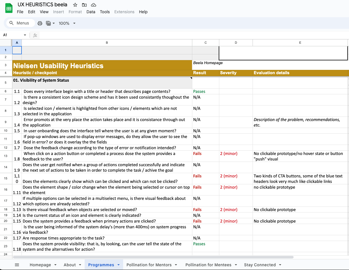
Our team went through the website together and took notes using Google Exel Spreadsheet so we could tag notes by the possible 10 heuristics violated and mark the level of severity.


